Your Dashboards and Reports Just Got a Head-to-Toe Consistency Pass
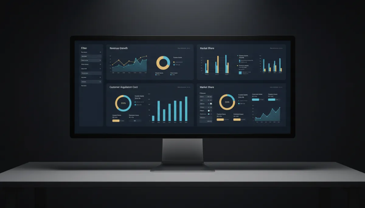
If your dashboards ever felt like they were stitched together from a few different eras — one chart styled this way, a filter panel that looked like it came from another tool, spacing that shifted as you clicked around — you weren’t imagining it. Reporting had grown in pieces. Now it’s been pulled into one consistent visual system.
Nothing about your data changed. Everything about how it looks and feels did.
One visual language, end to end
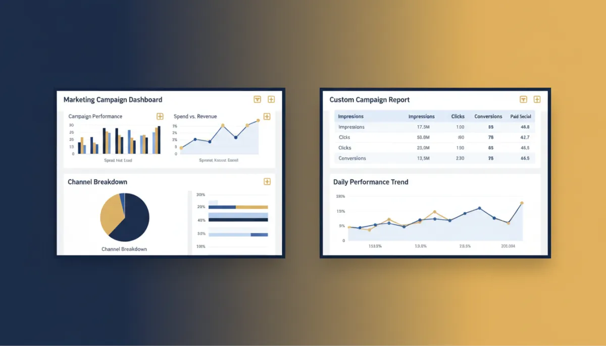
Every chart and widget type — numeric, bar, donut, line, table, funnel, and the rest — now shares consistent loading states, error states, and card styling. The header, navigation, breadcrumbs, side panel, and modals are visually unified. Advanced filters, the quick-filter panel, and the datepicker all follow the same look across dashboards and reports. Even the custom metric builder and formula builder got a cleaner, more consistent layout.
The result is subtle but real: nothing looks out of place as you move between pages, and the mismatched-element friction is gone.
Same numbers, same widgets — but nothing looks bolted on anymore. Your reports finally look like one product.
What this means for you
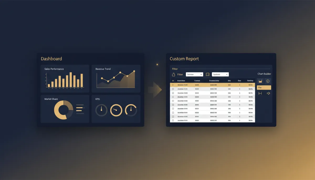
This is a UI-consistency update, not a functionality change — and it’s worth being straight about that. No workflows, data, or existing dashboards changed. Your reports, widgets, filters, and custom metrics are all exactly as you left them; they just render in the unified style now.
Two practical notes: if you’ve added custom CSS to your dashboards, review it, since the component alignment may need a small tweak. And you’ll turn the refreshed experience on yourself — it’s opt-in.
How to turn it on
Go to Settings → Labs in your account and enable “Dashboard and custom reporting – UI consistency update.” The refreshed interface then loads automatically when you open Dashboards or Custom Reports, with all your existing setups intact. Spot something off? There’s a feedback button right there.
The takeaway
If your reporting has felt visually patchy, switch on the consistency update in Labs and give your dashboards the clean, unified look they should have had. Same data, same features — just a reporting experience that finally hangs together as you use it.
Simplify. Automate. Scale.
